The US Department of Labor needs a more user-friendly layout and navigation, allowing users to more easily accomplish the most common goals of using the DOL site. To do so, I simplified the navigation header, organized secondary navigation links using alphabetization and grouping of related content, and incorporated better chunking on the homepage.
I began by performing a heuristic evaluation, usability annotations, and conducting five zoom interviews to see how users accomplish tasks on the website. These insights were organized in an affinity diagram and a user persona was drafted. Issues were identified with the amount of links on the webpage and the layout of the forms page in particular. It was difficult for users to find what they were looking for due to lots of needless information and organizational confusion. To fix this I would need to cut through the noise and create a clear user path.
User Goals:
Identified Problem:
The US Department of Labor website needs to consolidate a wide variety of services and info for its users. Extensive usability testing facilitated a cleaner, more organized navigation layout.
Solution:
Create a more user-friendly layout and navigation, allowing users to more easily accomplish the most common goals of using the DOL site.
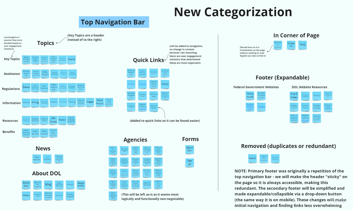
To help the user accomplish the identified goals, I planned to simplify the navigation header, organize secondary navigation links using alphabetization and grouping of related content, and incorporate better chunking on the homepage.
I created lo-fi wireframes for the navigation, and tried to minimize the amount of content on the homepage, so that users could more easily explore the page. A new navigational system was implemented. Visual polish and a clean, relaxing color scheme based on my style guide was applied. I felt that the webpage could use some calming colors, as users often visited the DOL because they were stressed about their work, or going through unemployment. Helping them feel at ease was imperative.
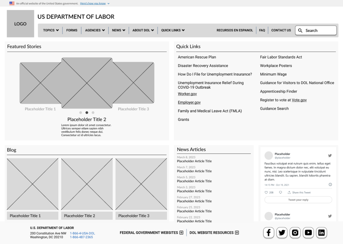
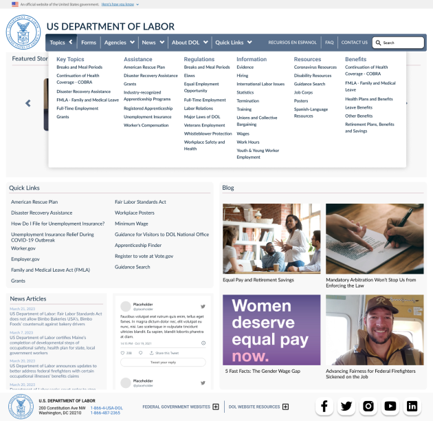
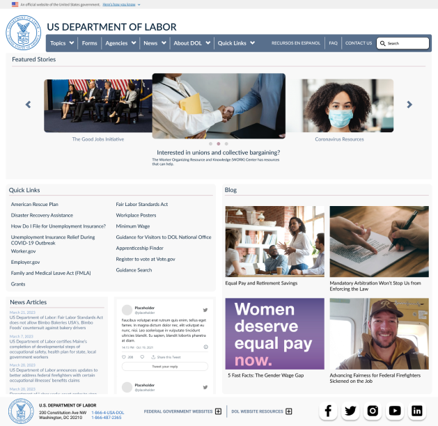
User testing revealed there was still some work to do. Primarily with the carousel on the homepage, which needed more user-friendly interaction. Instead of small clickable bubbles to alternate between "featured stories," larger arrows were created instead. Navigation was fully implemented, with hoverable results for quicker responsive feedback for the user.
Implemented Changes:
Redesigning the UI for the Department of Labor website was an invaluable learning experience. I was most surprised by how important the insights I received from testing proved to be, as they fully guided my efforts. The issues identified in that phase became the problems I needed to solve in the revised product. I initially expected to focus on visual presentation, but during the redesign process I found that the most crucial aspect turned out to be functionality and organization. Navigation structures are the means by which a user finds what they need and accomplishes their goals, so they must be as intuitive and logical as possible.